Receiving a parking ticket is inconvenient on its own, but an unoptimized parking violation payment website can make the experience even more stressful and overwhelming.
For this example, we will examine the Toronto Parking Violation Payment website. Although it is functional, this website could benefit from additional user-friendly features to prevent payment delays and strengthen its relationship with Toronto drivers.
We identified a few enhancements that can address these issues, such as inadequate real-time feedback, error correction difficulties, and the need for more intuitive navigation. By implementing these improvements, we can increase user satisfaction and efficiency, helping users complete their tasks faster and with fewer errors.
PROBLEM STATEMENT
How might we improve user efficiency and satisfaction by addressing user feedback, submission errors, and navigation?
These changes aim to create a more seamless and intuitive interaction for users, ultimately reducing frustration and encouraging prompt payments.
Proposed Enhancements
1. Add Error Prevention Tools
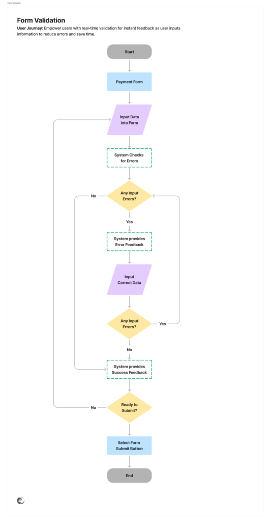
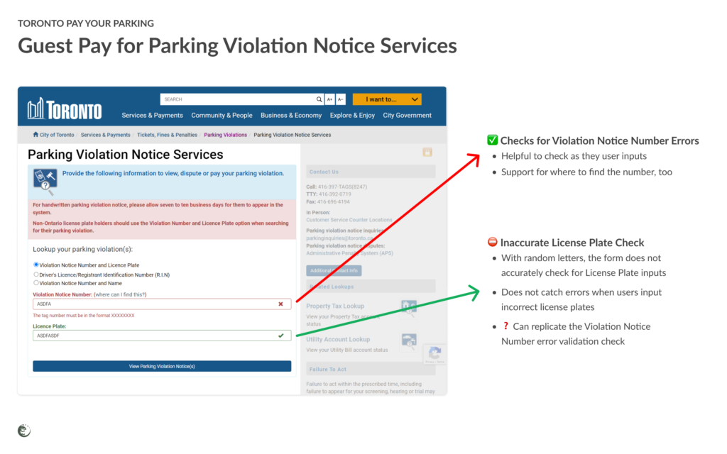
Solution: Implementing real-time validation checks can reduce frustration by alerting users to errors as they input information.
By introducing error prevention tools, we aim to create a smoother experience for users. Real-time validation checks will allow users to correct mistakes instantly rather than waiting for feedback after each time they click “Submit.”
With this proactive approach, the journey will reduce the likelihood of submission errors, ensuring users provide accurate information on their first attempt.
These tools can guide users to correct mistakes immediately, reducing the likelihood of submission errors and improving the accuracy of the information provided.
2. Provide Real-Time Feedback
Solution: Add real-time feedback and confirmation messages to enhance user confidence by providing immediate confirmations of payments or actions.
Real-time feedback is crucial in assuring users that their actions are successfully processed, especially regarding personal and payment information.
By adding immediate confirmation messages, users can feel confident from the reduced uncertainty about their information being processed while building trust with the system.
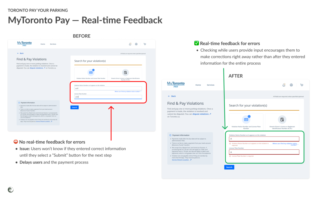
This instant acknowledgment helps users feel secure that their actions have been successfully processed, reducing anxiety and uncertainty.
3. Create Quick Access Options
Solution: Provide quick access options for tasks like paying or disputing tickets can streamline the user experience.
Quick access options are designed to minimize the time users spend searching for key features on the website. It also helps users find what they need quickly if they are not accustomed to opening the collapsable accordions.
By making essential tasks like paying or disputing tickets easily accessible, users can quickly complete their objectives without unnecessary navigation.
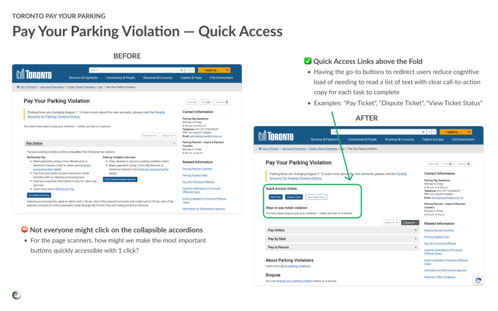
By having prominent buttons or a dedicated section on the homepage, users can quickly navigate to the most commonly used features without having to search through multiple pages.
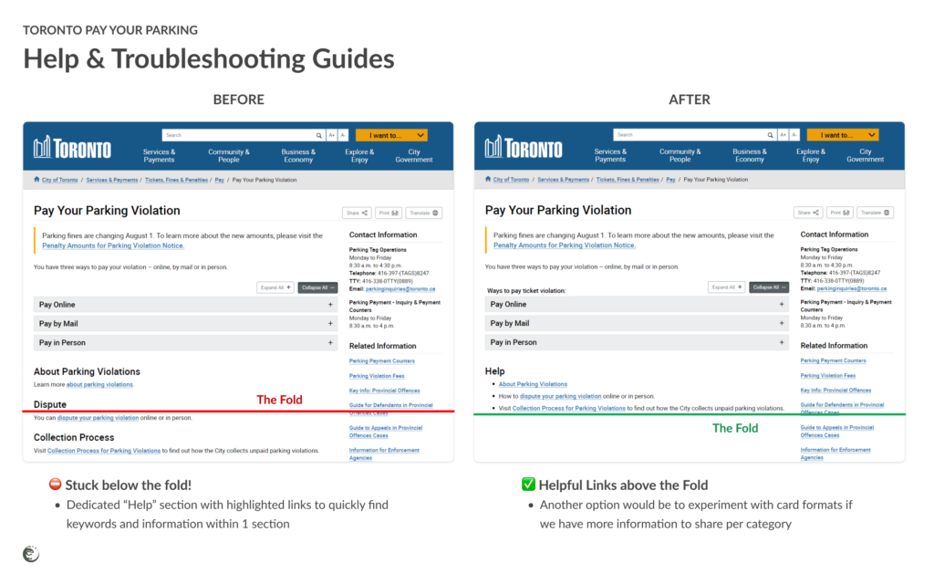
4. Offer Troubleshooting Guides
Solution: Develop detailed troubleshooting and error recovery guidance to empower users to resolve issues independently.
Offering robust troubleshooting guides can significantly reduce the burden on customer support by enabling users to solve common issues on their own.
A well-organized Help section with step-by-step instructions ensures users can find the information they need immediately to address problems quickly, efficiently, and confidently.
5. Enhance Visual Engagement
Solution: Add visuals, icons, and colour-coded sections can improve user interaction without compromising the minimalist design.
Visual elements can greatly enhance the user experience by making the site more engaging and easier to navigate. Incorporating icons and colour-coded sections helps users find information quickly, guiding them through the process intuitively and effectively.
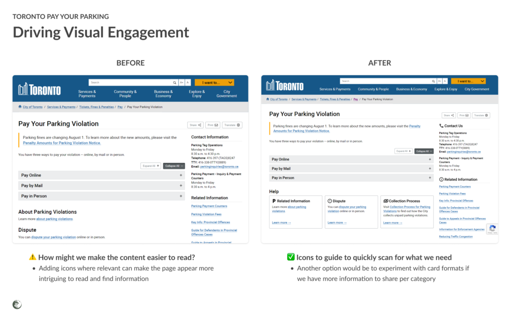
These elements can make navigation more intuitive and visually appealing, helping users to find information and complete tasks more easily.
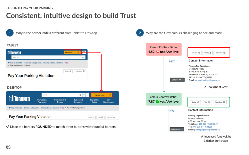
6. Ensure Consistency
Solution: Ensure consistency in language and formatting across the site fosters familiarity and trust, making navigation more intuitive.
Consistency across the website in terms of language, design, and layout creates a familiar and reliable environment for users. It will help users predict where to find information and how to interact with different features, reducing confusion and increasing trust in the system.
How will these changes affect the experience?
Enhancing the Toronto Parking Violation Payment website involves implementing the above changes that are only a few of the many improvements we can apply to improve content and form accessibility to make the experience more efficient to manage parking violations.
By addressing these areas, we can create a website that is not only functional but also a pleasure to use, encouraging prompt and accurate transactions for Toronto drivers and the City of Toronto Pay Your Parking administrative staff.
…
Want to make your website easier to use?
Contact our team to optimize your site with seamless user experiences to achieve your business goals sooner.
Schedule a meeting with Team Remutate🦎🇨🇦📞