Navigating Canada.ca can be daunting for new immigrants seeking information on immigration, health, and employment.
At Remutate, we understand how resourceful yet overwhelming it is to search for information on the Canada.ca website.
So, how would our team approach redesigning the Canada.ca experience to find information as a Newcomer to Canada?
PROBLEM STATEMENT
How can we simplify the Canada.ca website to help newcomers easily find key information on immigration and prevent feelings of overwhelm?
Top Issue to Tackle: Navigation Difficulties
Challenge: Newcomers find it confusing to locate sections on immigration, health, and employment due to the extensive amount of information on the website and navigation menu.
Our Approach: To reduce the user’s cognitive load, reducing the need to memorize everything especially when preparing for a significant change like immigration.
We would implement the following changes:
- Introduce an intuitive navigation system with a prominent "Newcomers" tab on the homepage.
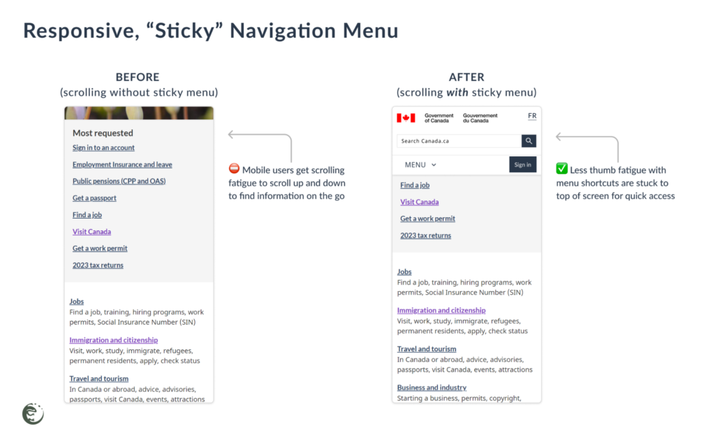
- Check for and implement a clear menu structure, breadcrumb trails, and a sticky navigation bar where applicable.
Canada.ca’s existing navigation strategy includes breadcrumb trails when moving between pages and can benefit from a sticky navigation bar.

What could the redesigns look like?
Responsive Navigation Menu
Challenge: Users need easy access on both mobile and desktop devices.
Solution: A sticky navigation bar improves usability, making navigation quick and accessible wherever the user is on the page.

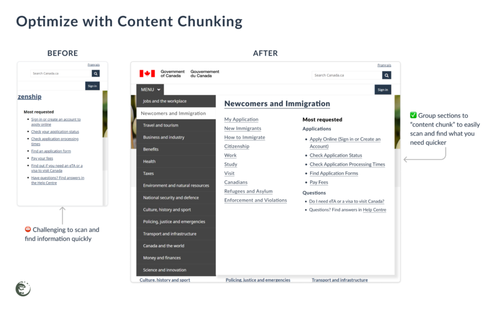
Optimize Information Architecture
Another way to make the menu easier to navigate is to reorganize the information as follows:
- Prioritize critical information at the top
- Content Chunking to break down text into smaller sections
- Use Progressive Disclosure to reduce initial complexity

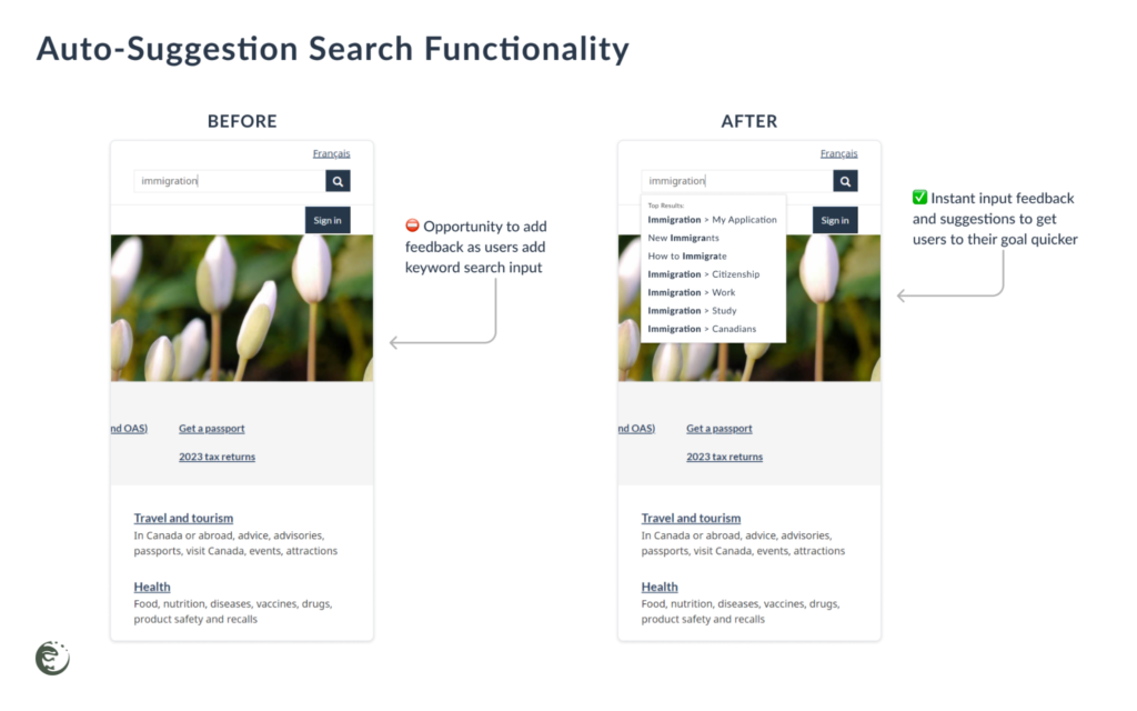
Auto-Suggestion Search Functionality
To help users quickly identify relevant information, we explored the idea of including auto-suggestion search functionality to assist with language barriers and remembering complex terms.

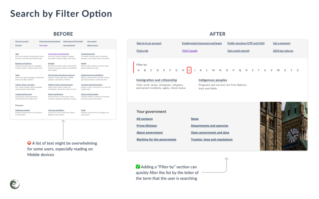
Search by Filter Option
At first, we considered adopting an even cleaner layout with ample white space to minimize distractions, but we realized a quicker way to navigate the list of information is more important.

Continuous Improvement
Is that the end? Of course not!
To continuously improve the site, gathering user feedback forms and surveys and conducting usability testing will check that the changes provide value to newcomer users.
With more user feedback, we can identify more issues to resolve to improve the user experience one step at a time!
Phew! Easier to navigate Canada.ca now
By simplifying navigation and reducing information overload, newcomers can easily find essential information, reducing stress and making their transition to life in Canada smoother and more manageable.
What do you think? Let us know!
...
Want to make your website easier to use?
Contact our team to optimize your site with seamless user experiences to achieve your business goals sooner.
Get in touch with us today!