
The CanadaBuys homepage is the vital entry point for users exploring tender opportunities and procurement resources.
Although the system “works,” how might we make the homepage more user-friendly to improve usability, empower users, and create a more welcoming experience for all visitors? This analysis highlights what works, what could be improved, and actionable, simple ways to enhance the user experience.
PROBLEM STATEMENT
How might we improve usability for experienced and first-time visitors to efficiently access tender opportunities and leverage the website’s full potential?
Show What’s Happening in Real Time
The homepage does a great job of making key tools like the search bar and navigation menu easy to find. However, users often benefit from real-time updates that help them stay informed without extra effort. Adding dynamic elements like notifications can make the experience more supportive to its users.
What works: Key tools like the search bar and navigation menu are visible and accessible.
What could be better: Adding real-time updates, such as notifications for new tenders or a “Last Updated” timestamp, would provide more confidence in the information displayed.
What it could look like: A timestamp below the search bar showing when the data was last refreshed.

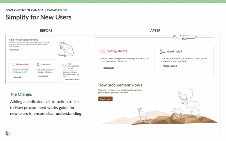
Simplify for New Users
Experienced users might find the industry-specific language clear, but first-time visitors may feel overwhelmed.
The homepage should aim to accommodate both groups by providing accessible explanations and intuitive guides—because we all start somewhere!
What works: The website uses industry-relevant language, which suits experienced users.
What could be better: For beginners, simple explanations or hover-over tooltips for technical terms could improve understanding without needing to navigate back and forth from the “Getting Started” page.
What it could look like: A dedicated call-to-action section with a “Start Here” button linking to the beginner’s guide.
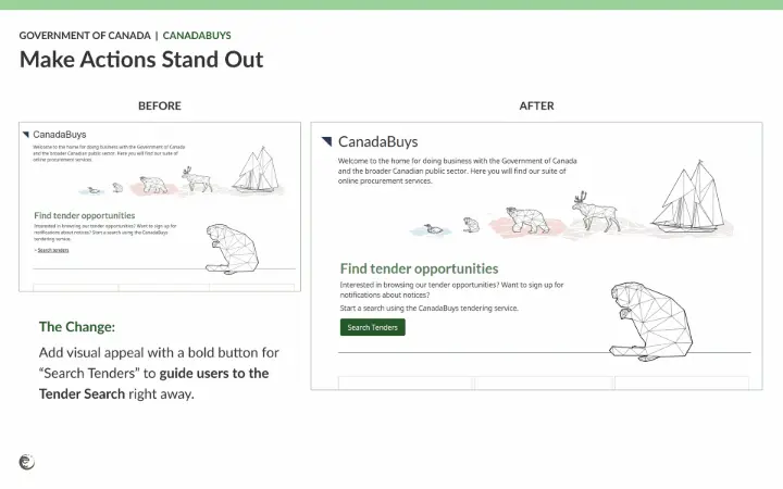
 Make Actions Stand Out
The navigation on the homepage is functional, but actions like searching for tenders should be visually prioritized to guide users.
The homepage can better direct users toward their goals by making primary actions more noticeable.
What works: The navigation is consistent and predictable.
What could be better: Use distinct, visually prominent buttons to highlight primary call-to-actions (CTAs), such as “Search Tenders."
What it could look like: A bold, visually appealing button for “Search Tenders” contrasted against smaller, plain-text links for secondary actions.
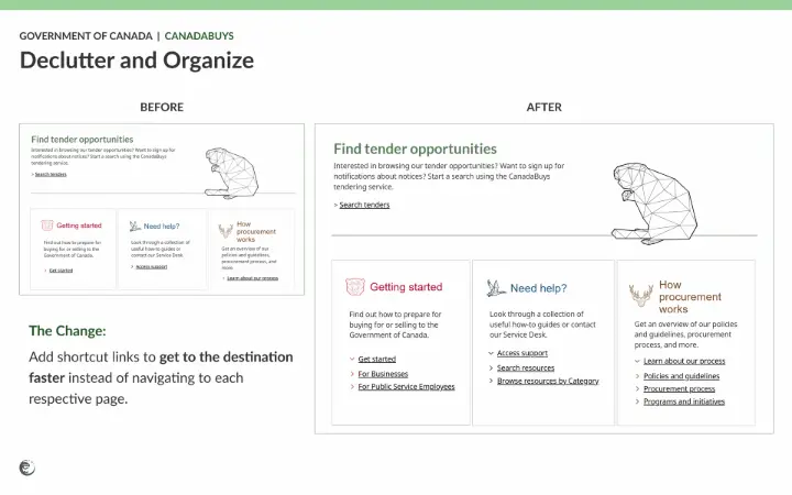
Declutter and Organize
A clean layout is crucial for usability, but if the content isn't grouped thoughtfully, the page might still have information overload.
Reducing visual density can make the homepage more digestible and easier to navigate.
What works: The homepage maintains a clean and straightforward layout.
What could be better: Reducing information density by grouping related content into collapsible sections can create a more focused user experience.
What it could look like: A streamlined section with expandable menus per tool and resource to navigate to from the homepage.
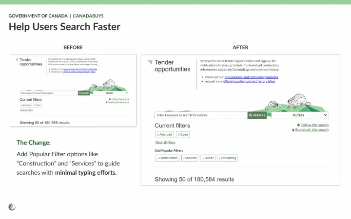
Help Users Search Faster
The current search bar is a strong feature, but adding intuitive filters and categories can make the tender search process even faster and more effective.
This helps users find exactly what they need with minimal effort, so they can focus on the content instead of learning to search with the “right” keywords for returning and new users.
What works: The tender search bar is easy to locate.
What could be better: Pre-set filters and featured categories could make searching quicker and more intuitive.
What it could look like: A filter bar with options like “Construction,” “Services,” “Goods,” or “Consulting,” showcasing popular tenders to begin and continue their search.
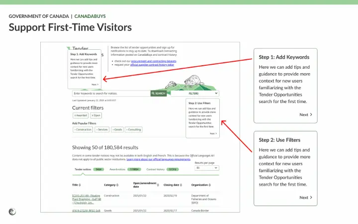
 Support First-Time Visitors
Help resources are already available, but an onboarding experience directly on the homepage could improve accessibility for new users.
This ensures they feel confident navigating the platform from the start.
What works: Help resources are accessible through the main navigation.
What could be better: A quick onboarding experience or tutorial could help new users get started.
What it could look like: An interactive overlay guiding users through key features like the search bar and filter options.
How Will These Changes Help Users?
The CanadaBuys homepage can become more intuitive, efficient, and welcoming by addressing these usability gaps.
These adjustments can empower all users, whether they are experienced professionals or first-time visitors, to find tender opportunities with ease and confidence.
…
Want to make your website easier to use?
Contact our team to optimize your site with seamless user experiences to achieve your business goals sooner.
Get in touch with us today!