At Remutate, we recently focused on the challenge of navigation websites filled with helpful content that’s difficult to read and locate. How can we enhance these experiences to ensure users easily find the information they need?
For this example, we turned our attention to Canada Revenue Agency’s (CRA) website, particularly since the recent passing of the Corporate Tax deadline had more interest during this season.
Navigating the CRA website can be challenging, especially when searching for essential information like the General Index Financial Information (GIFI) number. Our goal is to address this challenge by improving the overall experience for corporate tax filers — like ourselves!
PROBLEM STATEMENT
How might we improve the user-friendliness of CRA’s corporate tax user journey, specifically in finding content and information such as the GIFI number?
#1 Modify the “On this page” Shortcut Section
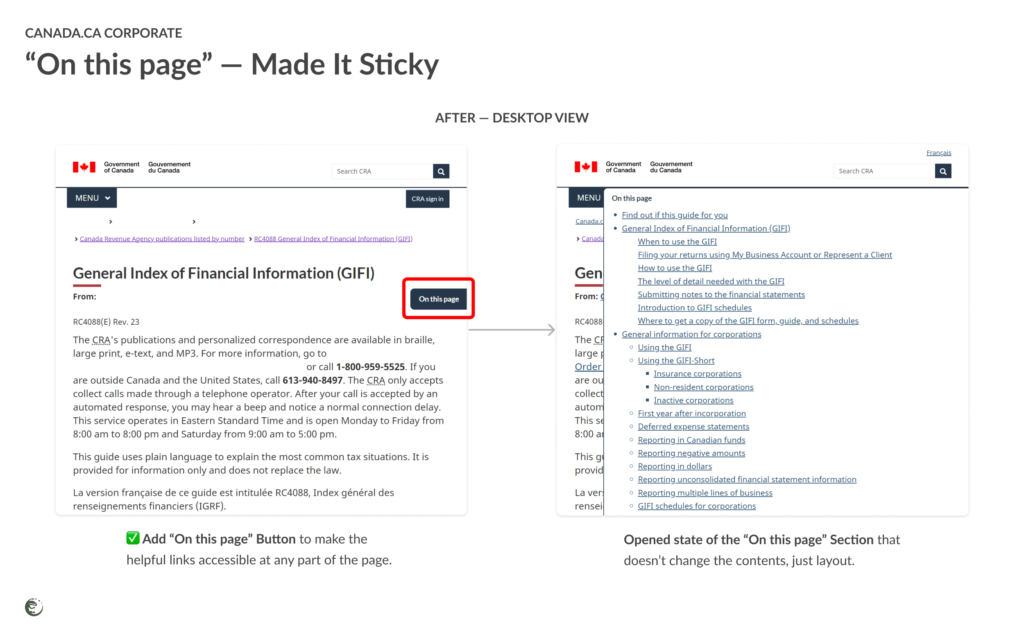
Have you ever felt lost on a website, trying to find one crucial piece of information? You're not alone. The “On this page” shortcut links are helpful yet fatiguing when you need to scroll past a ton of content to return to these shortcut links.
Make it Sticky: Making the “On this page” section fixed to the top of the screen. This change will make it easier for users on all screen types to access the links at any point on the page, enabling quick navigation to other sections of content.
🌟 Benefit: Finding content like GIFI numbers will be a breeze, reducing frustration and making information retrieval quick and easy.
#2 Improve Content Organization
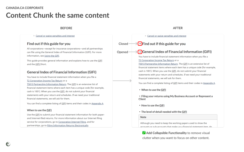
Finding information on the CRA website shouldn't be a maze. Here's our plan to organize content better:
- Streamlined Layout: Group related content logically and present it in a clear, hierarchical structure.
- Consolidate Information: Reduce redundant pages and consolidate similar topics to minimize unnecessary clicking.
🌟 Benefit: No more endless clicking—everything you need in one place!
#3 Add User Guidance & Support
Navigating the GIFI can be tricky, but with our clear guidance and support, it doesn’t have to be:
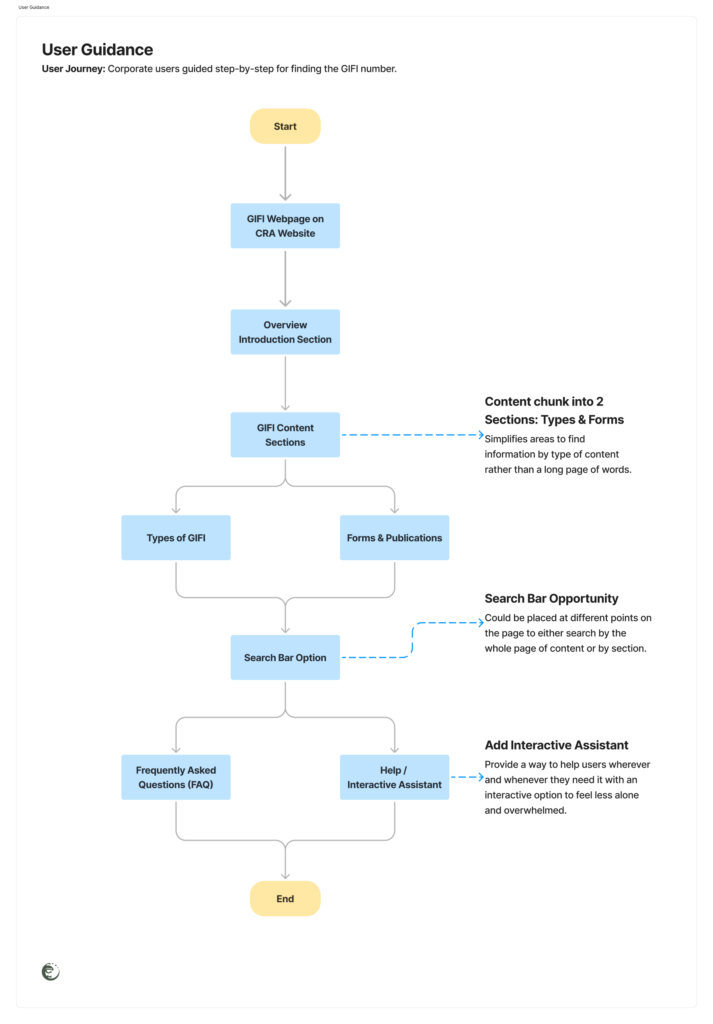
Step-by-Step Guides: Follow our easy steps to find what you need.
- Start: Open the GIFI webpage on the Canada Revenue Agency website.
- Overview: Read the introductory section to understand the purpose of GIFI.
- Sections:
- Types of GIFI: Find information on different types of financial information covered.
- Forms and Publications: Locate forms, schedules, and guides related to GIFI.
- Search Function: Use the search bar if looking for specific details or terms.
- FAQ and Help: Check the FAQ section for common questions or contact support for assistance.
- Add Interactive Assistant: Get real-time help whenever you need it.
🌟 Benefit: With these tools, you'll never feel lost again!
Additional Considerations
Sometimes, not everything can be updated in the first iteration. Here are two more changes to include in future updates to enhance content accessibility.
#4 Link Visibility & Accessibility
Finding important documents should be simple. Alongside making call-to-action buttons more prominent, important links need to be clearly highlighted.
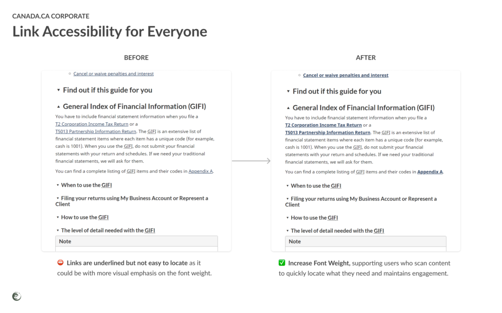
Highlighted Links: Key links will be bold and color-coded for easy spotting.
🌟 Benefit: No more searching—important documents are right at your fingertips!
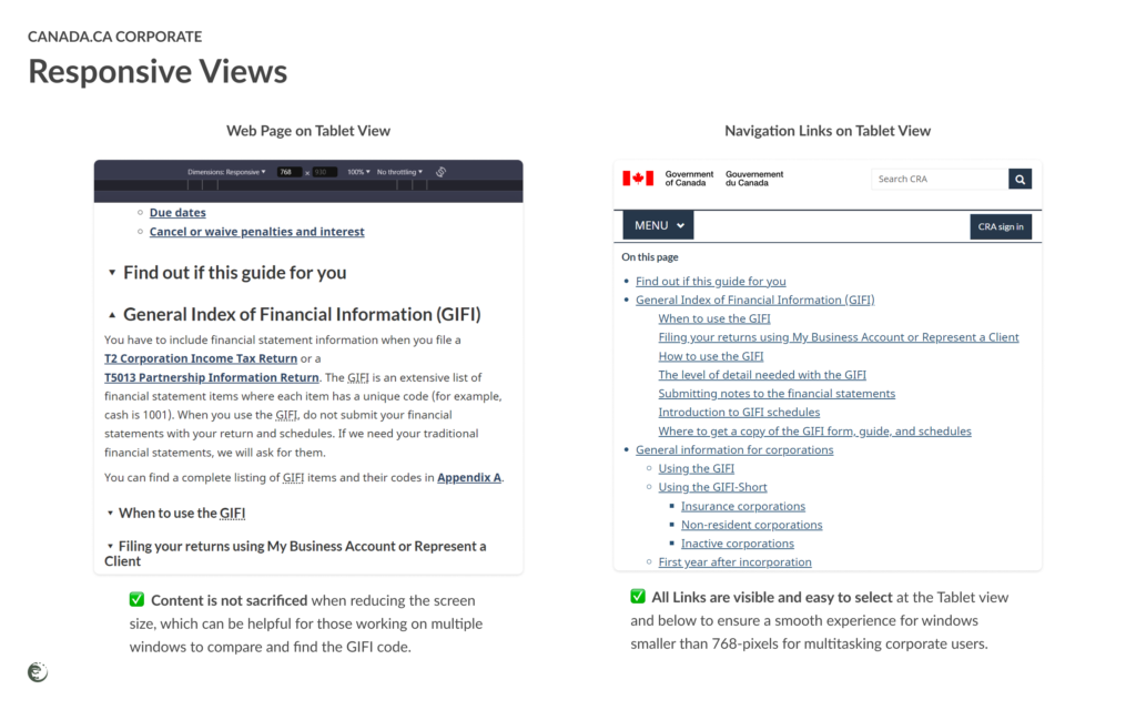
#5 Check for Responsiveness
Not all users view the CRA website from large screens.
Responsive Design: Ensure the webpage adapts seamlessly to various screen sizes.
- Seamless Adaptation: Content adapts to any screen size.
- Visual Representation: Include images of the webpage on desktop, tablet, and mobile views to demonstrate responsive design.
🌟 Benefit: Enjoy a seamless experience, no matter your device!
Is that everything?
Are there more aspects we could improve on? Of course, but let’s begin with the essential changes.
By addressing these issues first, the primary function of this user experience will significantly improve, making it easier for users to find and understand the necessary information.
This will lead to more efficient and satisfactory interactions with CRA's corporate tax resources, ensuring users can efficiently find the GIFI number and related content.
…
Want to make your website easier to use?
Contact our team to optimize your site with seamless user experiences to achieve your business goals sooner.
Get in touch with us today! 🚨📞